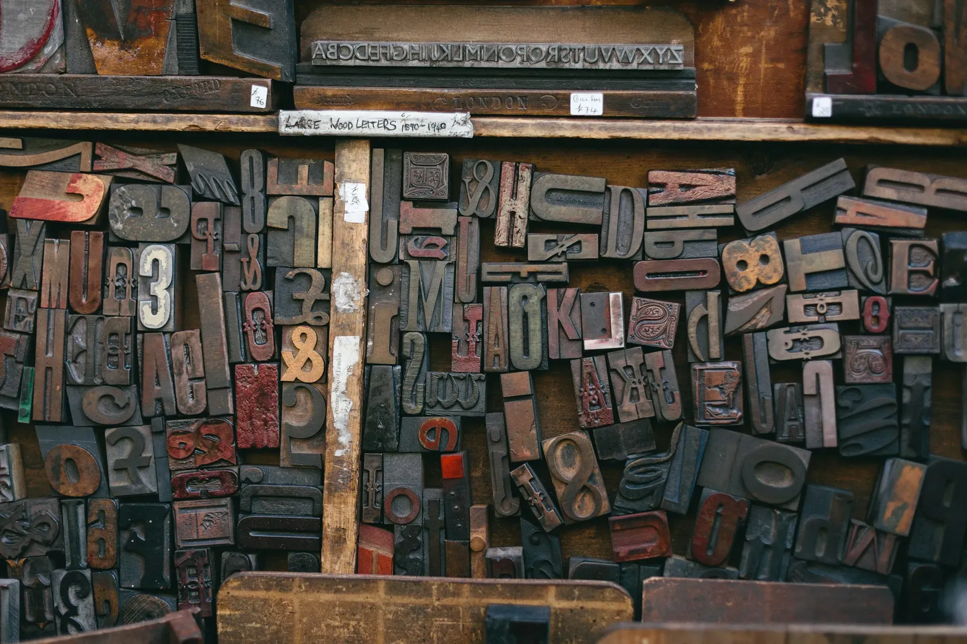
Open the font menu on any design tool and there are thousands of typefaces waiting. It’s tempting to use a lot of them - a characterful one for headings, something else for body text, a third for buttons, a script for the odd flourish. The result almost always looks busier and cheaper than the person intended.
We tend to build entire sites on one typeface. Sometimes two. Not because we ran out of ideas, but because restraint with type is one of the quiet things that separates a site that looks considered from one that looks thrown together.
One typeface does more than you’d think
A good typeface isn’t one font. It’s a family - the same letters drawn at a range of weights, from light through to heavy, usually with italics. That range is enough to build a whole hierarchy. A bold heading, a medium subheading, a regular paragraph, a lighter caption: all clearly different, all unmistakably related, because they’re the same voice spoken at different volumes.
That last part is the point. When everything shares one typeface, the page hangs together. The eye reads it as one coherent thing rather than a collection of parts that happen to be near each other. You get variety from size, weight, and spacing - tools that organize a page - instead of from switching fonts, which mostly just adds noise.
When a second font earns its place
None of this is a vow of poverty. A second typeface can be exactly right, when it’s a real pairing chosen on purpose: a distinctive display face for headings, set against a plain, highly readable face for body text. The two play different roles, and the contrast between them is doing a job.
The trouble starts when fonts pile up without a reason - three or four of them, each chosen in a different mood, none quite agreeing with the others. That’s not a pairing, it’s a pile. The test for a second font is simple: can you say, in a sentence, what job it does that the first one couldn’t? If you can’t, you probably want one font, not two.
Body type should be a little boring
Whatever you pick for the words people actually read, the bar is readability before personality. Body text has to hold up at small sizes, on a phone, for paragraph after paragraph, without tiring the reader out. The fonts that do that well tend to be unshowy by design, and that’s a feature. Pair a calm, legible body face with enough breathing room - which we got into in what empty space does for a page - and the reading just disappears, which is what you want.
There’s a practical cost too. Every typeface is something the browser has to download before the text settles, so a stack of them is a stack of small delays. Fewer fonts is part of why a lean site feels quick, which we covered in what actually makes a website fast. Restraint with type is good for the look and good for the load.
This site runs on a single typeface, used across every page. That’s not a limitation we’re working around. It’s the look, on purpose - and it’s most of why the whole thing feels like one place rather than a dozen. If your current site feels a little chaotic and you can’t put your finger on why, the font count is a good first place to look. We’re happy to take a look with you.